Responsive Design is wonderful: you make your UI once, and have it automatically redesign itself to fit different screensizes and shapes, while looking great in all of them.
Game developers have been missing this feature – until now. It has dominated the web-design world for the last 5 years, where it is especially powerful for making a UI that works equally well on mobile/tablet and desktop/console. Let’s look at how to do it.
NB: if you have Flexbox4Unity v3.1.2 or newer, there is a demo-scene included in the project: “Demos/V3.x Demoscenes/Responsive Design v2”, that looks like this:
Our goal: a responsive layout
Here’s our end-goal, a layout that dynamically changes based on the size/shape of the screen, allowing you to have UI that intelligently fits the screen and the user:
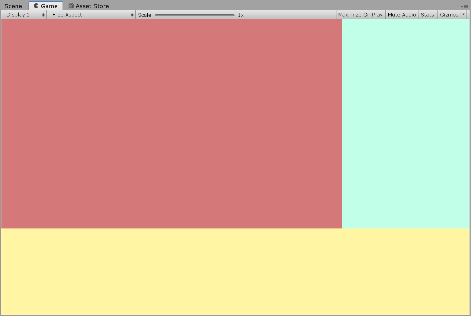
Everything in that layout is UnityUI – so you can then fill those coloured areas with UI Text, Button, TextField, background Image/RawImage, etc.
The secret sauce: Flexbox and FlexWrap
In web-design, responsive design only became elegant and easy when Flexbox was added to CSS. Similarly in Unity: we’ll need a Flexbox upgrade to UnityUI.
For this you’ll need the pro version of Flexbox4Unity (the lite version doesn’t currently support flex-wrap, which is where most of the magic happens). You can download it from the Asset Store here.
Flexbox has a built-in layout feature where it will automatically “wrap” content that doesn’t fit on one line. After it’s calculated the wrapping, Flexbox then runs its own core layout algorithm, which intelligently expands/contracts every UI item to fit the local space it’s sitting in (this is where core Unity fails: UnityUI has no ability do to that on its own).
Step 1: Create a basic Flexbox UI
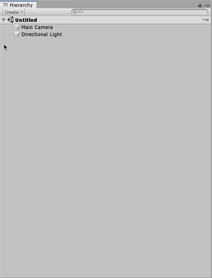
This is the same for all UIs. Install Flexbox4Unity from the AssetStore, then make a basic UI (Canvas + main FlexContainer).
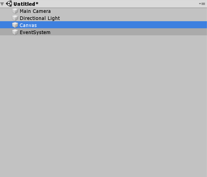
Create a UI Canvas:
…and a FlexContainer inside it, that will hold your UI:
…finally: press the green button in the Inspector so that Flexbox automatically resizes the root container to fit your full screen/canvas:
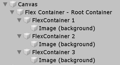
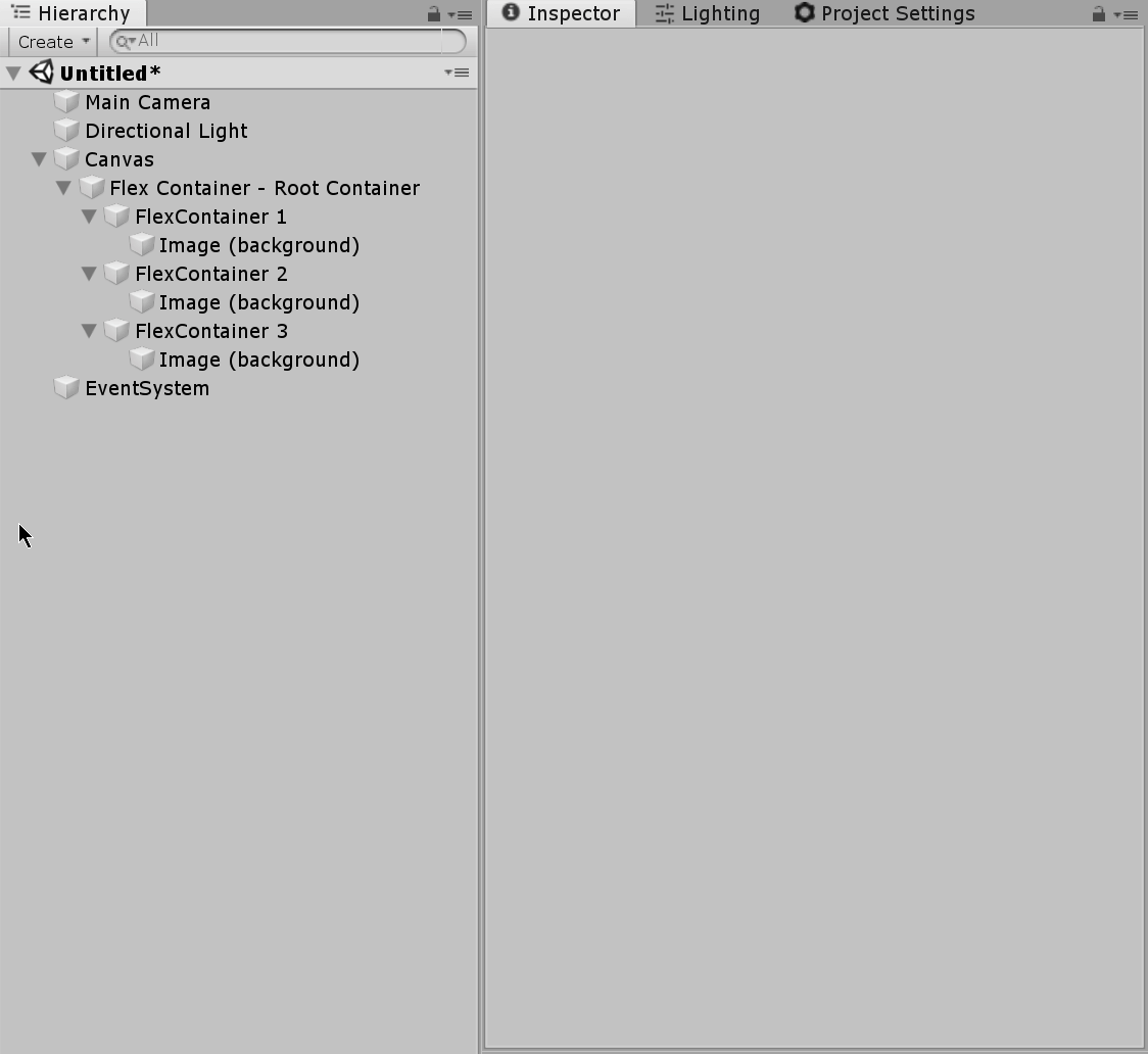
Step 2: Create three containers for our UI
Inside the root container, create three more FlexContainers. In each container, create an Image and assign it a different color so that you can easily see them:
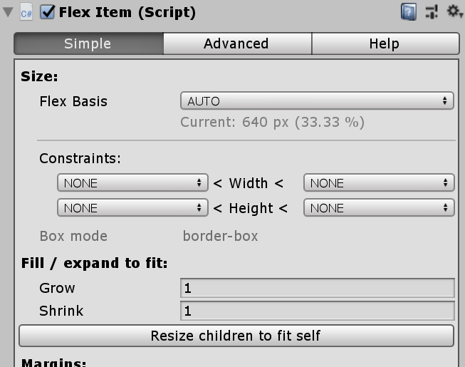
With each Image, get Flexbox to automatically take control of resizing it. Do this by selecting each FlexContainer and clicking the automatic “resize children to fit self” button in the Inspector:
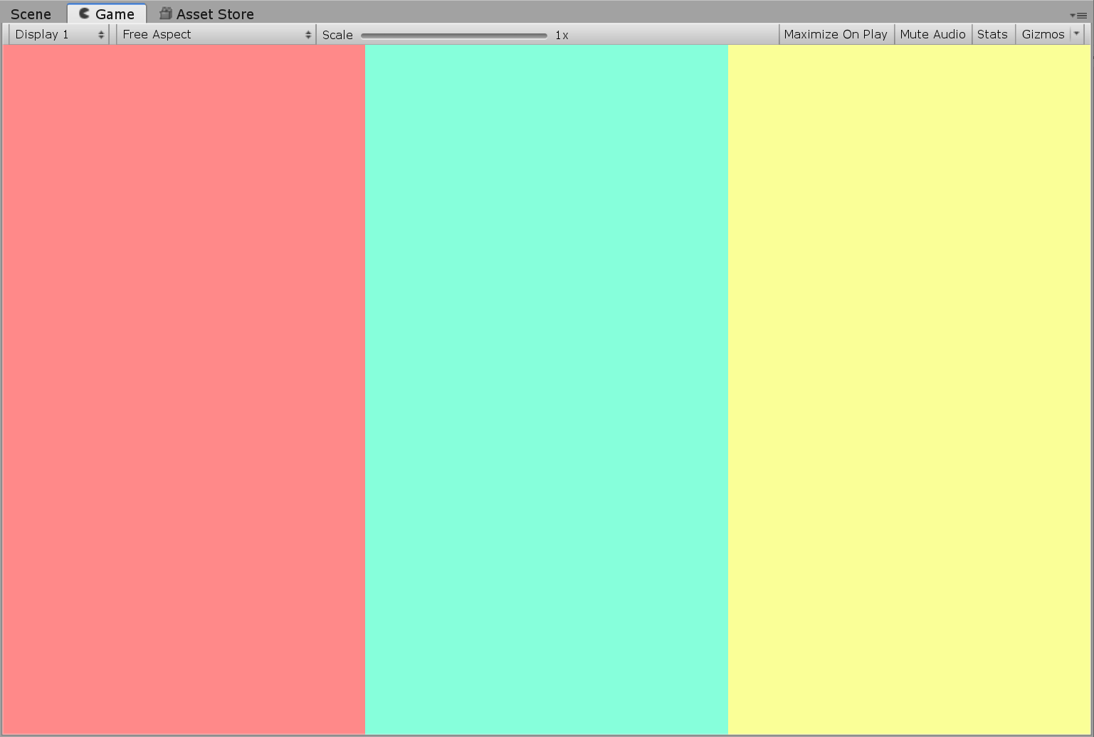
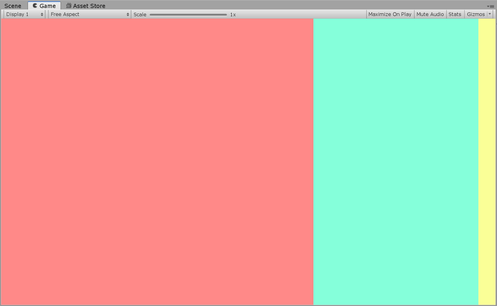
If you look in the Scene/Game view, you should now have something like this:
Step 3: Enable wrapping / flex-wrap
By default, Flexbox does not wrap (this is to ensure compatibility with the official CSS specification). Enable it by selecting the root container and going into the Advanced settings:
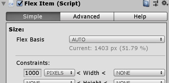
Step 3: Give each item a minimum size
Now everything is ready for us to do Responsive layout. We’ll do this by telling Flexbox that each Container has a minimum size.
By default, Flexbox always expands items to take up all the available space, and the minimum size will have no effect. But when the screen is too narrow, and the items can’t all fit without shrinking, flexbox’s “wrap” feature will automatically re-do the layout with multiple lines – and then automatically re-size the wrapped items to fit their new position.
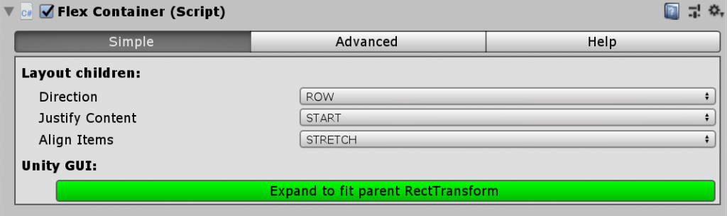
Set the first container to a MINIMUM width of 1000 pixels and the second container to a minimum of 500 pixels. Do this by selecting each GameObject and changing the values in the “FlexItem” inspector:
Try resizing your editor window, and you should see something like this happen:
Congratulations! Your first responsive layout in Unity!