
What do I need?
Unity’s core UI system (UnityUI, also known as “uGUI”) has no support for Flexbox. However, you can download “Flexbox4Unity” from the AssetStore and it directly adds this missing support (there’s also a free version with reduced functionality if you just want to try out the basic idea).
There is also experimental support for Flexbox in Unity’s UITookit system, currently in pre-release and due for full launch sometime in 2021 – but this system is incompatible with UnityUI and cannot be used with most of the assets, plugins, existing code/games/widgets that you find in most projects. UIToolkit has some excellent advantages, especially for console games, but by design it is unable to do some of the things that UnityUI provides – which is why Unity lets you use either (you cannot use both).
How does it work?
Flexbox has only two concepts: Containers and Items. Items are the individual UI elements on your screen (button, text, image, etc). Containers simply hold (contain) items – and other containers (you can nest container-inside-container-inside-container as much as you want).
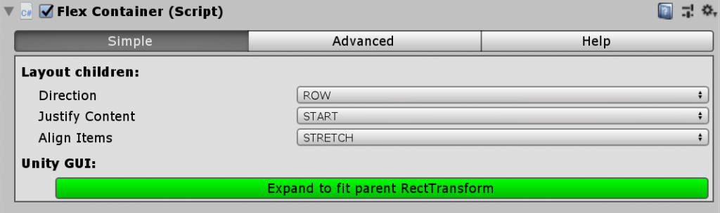
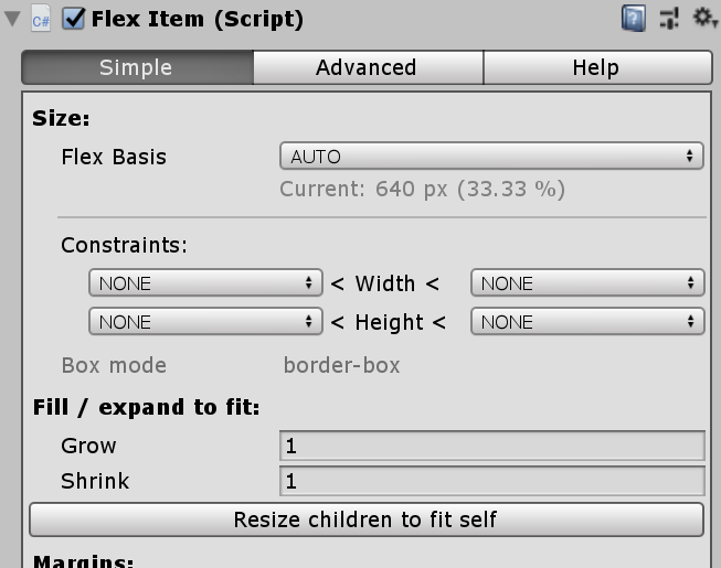
In Unity, a GameObject can have a FlexContainer component, a FlexItem component, or both. The FlexItem has all the settings for the GameObject’s own size – e.g. is it 400 pixels? or 50% of its parent? … does it have a maximum width? … does it have a minimum height? etc.
The FlexContainer has all the settings for the child GameObjects – e.g. are they positioned horizontally or vertically? … are they centered? Or left-aligned … or right-aligned? etc.
By contrast, Unity UI / uGUI has more than 5 “layout components” to achieve the same thing, and the Unity components are more complex and yet a lot less powerful (as we’ll see in a minute). Flexbox is simpler and more effective – but that’s no surprise: it took more than 20 years of iteration for the designers of Flexbox to create this global standard.
Flexbox4Unity / CSS Flexbox for Unity is fully compatible with both systems (UnityUI/uGUI AND CSS3/Flexbox), and works correctly in both of them. You can mix and match Flexbox layout with Unity components (Button, Image, etc), and everything will just work.
The simplest Flexbox UI
For flexbox to start running, you need:
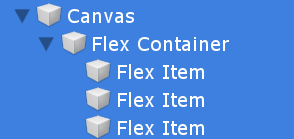
- a Unity Canvas
- a GameObject with a FlexContainer
The FlexContainer will detect when its inside a Canvas. Usually you want it to occupy the full size of the Canvas and to auto-resize to fit whenever the Canvas resizes – it will detect if this is not the case, and offer you a button to automatically fix itself.
Now you can immediately start building a Flexbox UI inside the FlexContainer.
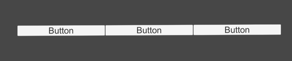
A very basic UI is a menu bar containing 3 buttons. To make Flexbox position and size the buttons, we need three FlexItems (one for each button), and we need to add a Unity Button to each FlexItem – that’s it! Nothing else is needed.
So, create three new GameObjects as children of your FlexContainer, with a FlexItem on each. You can do this quickly by right-clicking the FlexContainer in the Hierarchy view, and selecting “Flexbox > FlexItem” (it will create the GO and attach the FlexItem component).
Next, add a UI Button to each of the new GameObjects. You can use Unity’s built-in shortcut for this: right click a GameObject in Hierarchy, and select “UI > Button”.
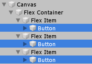
Finally: when you add a UI Button, Unity makes it a fixed size, but we want Flexbox to control the size. You can do this manually using the RectTransform – but if you select each FlexItem, you will see it has auto-detected the child Button, and noticed it’s not being auto-sized. Click the button “Resize children to fit self” to have it take control of the Button and autosize it from now on.
By default, Flexbox assumes you want objects to take up as much space as possible. If we had put Images in, that would be perfect. But for buttons, we want them to use a sensible size/shape. Flexbox4Unity has built-in autosizing for all core UnityUI elements, so all you need to do is tell it “stop maximizing everything in this container”.
Select the FlexContainer, and change the “Align Items” setting to anything except “Stretch”.
That’s it. You’re done! Flexbox was designed to automatically default to sensible values for everything, so it’s already positioned and laid out all your objects.
Upgrading your UI: Margins, Padding, and the CSS BoxModel
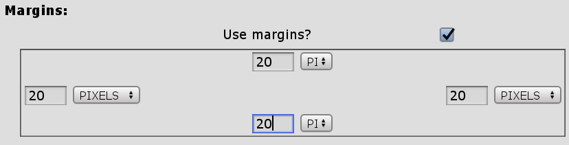
CSS3 (which Flexbox comes from) has the global standard system for controlling the padding and margins of every item. You’ll notice that each FlexItem has options for both. If you tick either of these boxes, you will enable them and Flexbox will start using padding and/or margins on that item.
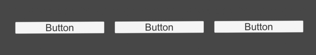
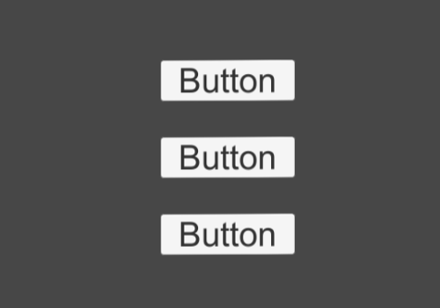
Let’s put some space around our buttons: Select each FlexItem, and enable Margins (this is defined as space OUTSIDE the object). The four new boxes are the top-, left-, bottom-, and right-margin. Note that each one can be specified in pixels (default), or percent (which is percent of the parent FlexContainer’s size – this lets you easily create auto-resizing layouts which is especially useful for rich layouts that work equally well across mobile and desktop).
Now our buttons are neatly spaced:
The ease of Flexbox: changing your UI
But what if we wanted to make this the main menu for a new game? Game menus are normally top to bottom. Do we need to recreate it?
Nope! All we have to do is select the FlexContainer, and set the “direction” to “COLUMN”:
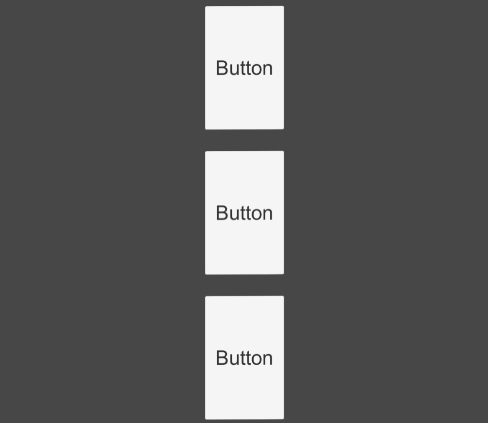
NB: Your buttons are now auto-sizing sideways, but filling the total space up/down. Previously (in ROW mode) they were auto-sizing up/down, but filling the total space sideways. To see how we can control the "filling the total space" setting, see the next section: Grow/Shrink.
Try playing with the different settings on each FlexItem and FlexContainer, and get a feel for what they do.
The power of Flexbox: Grow/Shrink
One of the most important features of Flexbox is “flex-grow”. Unlike Unity’s complicated resizing system, you have a single number for each item that controls how it reacts to resizing. This may sound too simple – but most of the code in Flexbox4Unity (thousands of lines of source code) exists to make this work automatically.
When there is more space than the FlexItems need, Flexbox looks at their “grow” values to decide what to do next. If any item has a “grow” of 0, then it won’t grow at all: it will remain its default size (which might be zero, if the FlexItem has no button/text/image). If all the items have a value of 1, then they will each receive an equal share of the spare space, and grow to fit.
But if they have a value more or less than 1, then they will grow by different amounts relative to each other. For instance, if we set the FlexContainer back to “direction: ROW” (making it horizontal), and give the middle button a grow of 2, and the left and right buttons a grow of 1, then the middle button will take up half the spare space (2 / (2 + 1 + 1)), and the left and right buttons will get one quarter each (1 / (2 + 1 + 1)).
Shrink does the same, but is only used when the FlexContainer is too small to contain the FlexItems. A Shrink of 0 means the item won’t shrink – and if none of them shrink, they will overflow the edges. (Incidentally: this is how Scrollview is implemented with FlexBox: you set all the rows in your scrolling area to shrink=0, and then Flexbox detects this and creates a large scrollable area. You still need to create a Unity ScrollView, but it will automatically size and position its scrollbars because of this).
So, take your buttons, select each FlexItem, and set the “grow” value to 0. Now they are auto-sizing in both directions.
NB: "grow/shrink" only applies to the direction that the FlexContainer is using (ROW or COLUMN). At the same time, the "justify: stretch" setting you changed earlier only applies to the direction that the FlexContainer IS NOT using (i.e. if the Container is ROW, then grow/shrink sets the horizontal growth, and justify sets the vertical growth).
Other Resources
Here is one of the most popular web-design resources for people starting out with Flexbox. All the concepts work exactly the same in Unity: https://css-tricks.com/snippets/css/a-guide-to-flexbox/
Responsive Design with Flexbox
Modern web designers have to make their websites work equally well on small mobile phones, on medium sized tablets, and on large desktop monitors – and every combination and size in-between. The main way this is done is using “Responsive Design”, something that UnityUI cannot do by default. But Flexbox is one of the key ingredients that allows this to work in webpages, and we can use it to do a similar thing in Unity.
This uses a feature called “flex-wrap”, which automatically wraps FlexItems when they are too large to fit the space, automatically converting between single-line layouts and multi-line layouts.
NB: [June 2020] this is currently experimental - you can enable wrapping by selecting any FlexContainer and clicking the "Advanced" button. By default, all FlexContainers are set to NOWRAP, but you can set this to WRAP. This works in most cases, but you may run into cases where it fails - please report any problems in our Discord channel, and we'll try to fix them ASAP.
A future tutorial will go into detail on building responsive interfaces this way.