I’ve been using Flexbox to layout Unity UI for almost 4 years now, ever since the first pre-alpha versions of Flexbox4Unity. Here’s my current (late 2021) guidelines.
Pre-requisite: understand the essence of Flexbox
Flexbox is the modern redesign of CSS3, intended to be the simplest possible way to layout complex UIs.
- Every piece of flexbox layout is a line (this is very simple!)
- either across the screen (columns) or down the screen (rows)
- Every UI is constructed by nesting these sub-layouts (lines) in different ways
- e.g. “columns of rows”, or “rows”, or “rows of columns”, or “columns of columns of rows of columns of rows”, … etc
- Flexbox’s layout system works in two phases:
- 1: ‘fit everything on screen’
- 2: ‘expand/shrink everything to fit the available space’
- Flexbox is pre-loaded with intelligent settings for each type of content:
- Images start at their pixel size, and don’t grow
- If Images have to shrink, they maintain their aspect-ratio
- Text blocks work at any width, and any aspect ratio
- But text blocks use up all spare horizontal space to become as few text-lines as possible
- Blank areas take up all spare space both horizontally and vertically, and shrink as much as needed
- …etc
- Flexbox has core features for aligning items
- center, left, right, top, bottom … and more
- Flexbox makes heavy use of CSS3’s concepts of ‘padding’ and ‘margins’
- Flexbox makes heavy use of CSS3’s ideas that width and height can be defined different ways, depending on the effect you want to achieve:
- “percent of available space”, or “fixed number of pixels”, or “minimum amount” or “maximum amount”
…if you memorize the above, you know almost everything you need to create very powerful and complex UI’s in suprisingly little time and effortlessly.
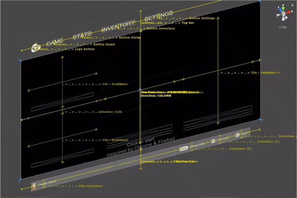
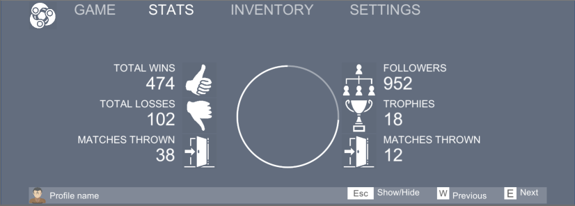
Example 1: Target goal
Here’s a UI I made purely inside Flexbox (inspired by ZoneUI), which resizes perfectly and fits on any screen size. This is extremely hard to do in core UnityUI, but very easy to do with Flexbox:
I’ll show you how I approached building this UI, which will teach you
two things. Firstly it’ll show you how to easily create a similar UI
yourself. Secondly you’ll learn the simple approach that you can apply
to your own designs to help you rapidly implement them with Flexbox.
Designing a Flexbox UI: The Breakdown
Remember the Flexbox Basics at top of this page: flexbox builds complex layouts out of lot of very simple pieces. The best way to create a design in Flexbox is to break it down into small pieces, solve each one, then put them back together. In traditional CSS this approach almost never works: there are too many dependencies and side-effects. Flexbox was specifically designed to remove those road-blocks, and allow designers to concentrate on small pieces at a time, and not worry about the overall effect.
Tip #1: Look for the fixed-size elements first
Of all the Flexbox UI’s I’ve built I’ve found this is the most important lesson: because Flexbox is so good at ‘automagically’ filling available space the one thing it needs YOU to do (as human/designer) is identify the bits that SHOULDN’T expand to fill space, and fix them first (then let Flexbox do its magic on the rest). Let’s look at this UI and identify the fixed parts.
There are five common kinds of fixing (NB: these are my own names, Flexbox doesn’t know or care about these differences):
- Locked: fixed in both directions (horizontal and vertical)
- Half-locked: Fixed in one direction, but can expand/contract in the other direction
- Locked-maximum: has a maximum size (the default) but is happy to grow/shrink up to that size
- Aspect-locked: both directions can resize, but the aspect-ratio must be maintained
- Aspect-maximum: aspect-ratio must be maintained, size cannot grow beyond a certain size, but will grow/shrink up to that size
The following rules of thumb are generally true:
- Content we imagine to be ‘locked’ is in fact ‘shrinkable’
- Layout areas we imagine ‘locked’ are in fact ‘half-locked’
- Large images are always ‘aspect-locked’
- Icons are usually ‘aspect-maximum’, but sometimes ‘aspect-locked’
When we look at the UI we find that … almost everything on there is
fixed in some way:
Tip #2: Look for the ‘half-locked’ and ‘locked-maximum’ items first
What we’re actually doing here is looking for the things that force resizing of other things: i.e. the layout-related items. If we figure out these first then we can set them up and get the overall layout correct, and worry about all the details (individual text, images, etc) later.
If we think of a UI as a set of boxes, containing smaller and smaller boxes – a tree – then we see that almost all UI’s have a few top-level boxes that split the whole visual area into 2 or more pieces. The classic ‘navbar at top of screen’, or ‘menubar in a native desktop app’, or ‘footer at bottom of webpage’ are prime examples.
Tip #3: Assume that all layout items are half-locked, and modify when needed
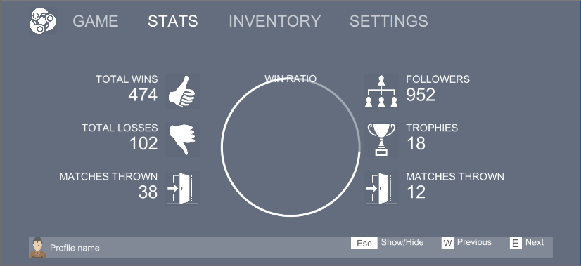
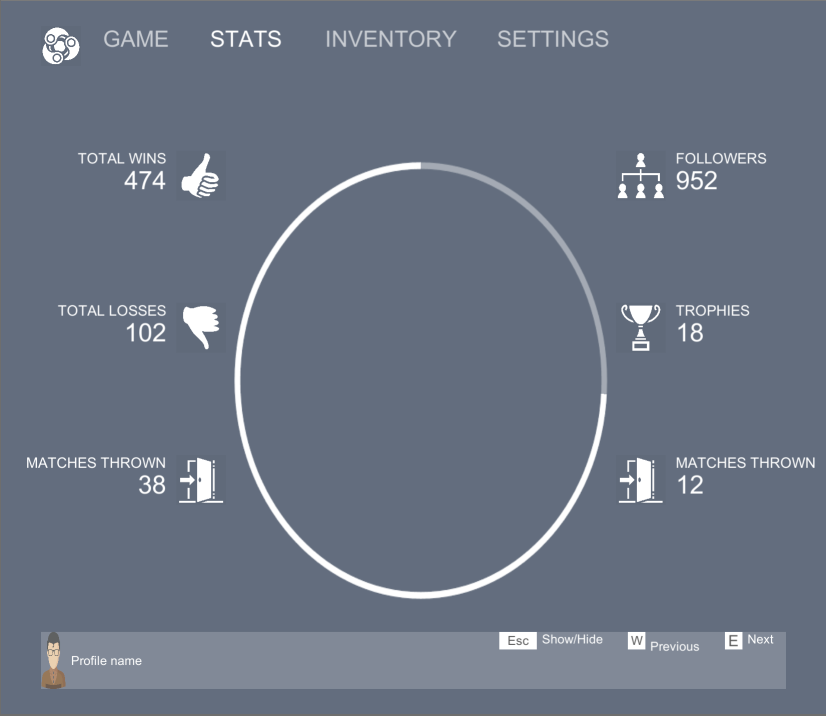
…Let’s take our highest-level boxes and split the screen, and assume they are half-locked – I’ll overlay colours for different areas that I think are different layout boxes:
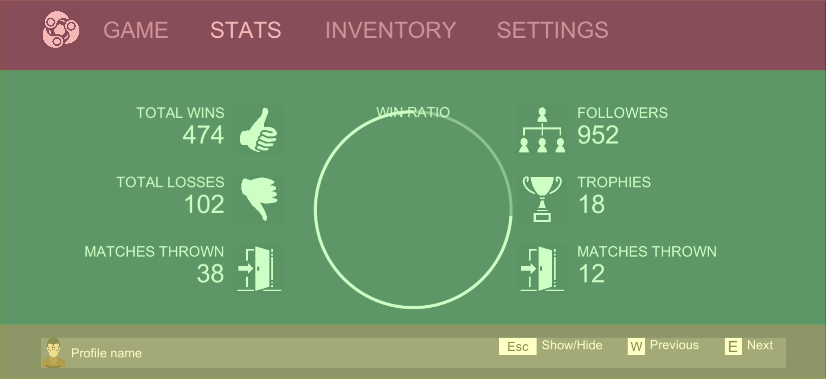
When I look at the screen I know:
- The menubar at top (‘GAME’, ‘STATS’, .. etc) – red overlay – I want to remain small no matter how big the screen is: it’s just a menubar
- The main area of the screen (with all the icons, the circle, etc) – green overlay – I want to grow/shrink to fit the big/small screen: this is my main content! It’s the most important stuff!
- The footer at bottom (‘Profile name’, keyboard shortcuts, etc) – yellow overlay – I want to remain small (like the menubar), but at the bottom.
Now we need to recursively breakdown the contents of each section: Header, Body, and Footer. Thanks to Flexbox’s core design we can do those breakdowns one at a time, then put them together at the end, and be confident it’ll all work nicely together.
Breakdown: the Header (simple)

Now that we’re inside an area that’s already half-locked (in previous section we decided that the Header will grow/shrink horizontally, but have a fixed height vertically) we have less freedom – and less to worry about!

We look at the header contents and see:
- In the direction that has fixed size (vertical) they all take up approximately “all the space”
- In the other direction, each item takes up variable space (long words take more, short words take less)
- The Icon at the left takes up fixed size based on its aspect ratio
There’s nothing here that will be half-locked, so there’s no further layout work needed, assuming we specify a height for the Header somehow in the Header/Body/Footer stage.
However: in reality we like to be a bit smarter: why specify a fixed height when we can use the content to automatically figure it out?
Most UIs have one or more items that – to a human viewer – ‘obviously’ define how high each menubar etc should be. e.g. ‘I want to set the font-size, and have it automatically pick a height for the header that matches that’, or ‘I want to include an icon, and the header should resize to fit that icon’.
We’ll come back to that later.
Breakdown: the Body, The Footer: TBC…
…we’ll come back to these later. They are no different from what we’ve done so far.
Designing a Flexbox UI: Implementing the Breakdown
Before we go into too much detail on Breakdown, let’s start building the UI and testing whether our breakdown is working as expected.
Tip #4: Always test your Flexbox UI in small pieces, build it up step by step
Because Flexbox was designed to work in small, independent, chunks it hugely rewards any designer who builds their UI in small, indepedent chunks. Trying to design the whole thing at once before you even test it is a very old-fashioned form of design, that’s proven to be OK for trivial UI but a huge waste of time and energy on complex/exciting UIs. Flexbox wants us to do it the easy, better, way – so let’s do that.
Starting with our top-level breakdown, we have three areas, two of which are fixed and one is variable:
To implement this we need to run down a checklist of what Flexbox is capable of:
- Are all the elements grouped into a single line – either horizontal or vertical?
- Can we define the size of each element without measuring anything else?
- NOTE: Flexbox allows us to define size as ‘pixels’, ‘percent of available space’, or ‘big enough to contain its children’
If either of the above items is false then: you tried to make your breakdown too complex — go back and break it into fewer, larger, pieces and try agin.
In our example everything is already in a neat vertical line (tick!), and the sizes are defined by … well: we can start by giving them an exact pixel size, say: “100 pixels”. On a huge screen the menubar and footer will look tiny (which is usually what you want). Alternatively we could give them a percent size, say “5”. Then the three regions will always be in the ratio 5:90:5. Either is fine – it depends what effect you want to achieve.
Tip #5: Combine percentage sizes with pixel sizes, using ‘max’ and ‘min’
What if you want the best of both worlds? There’s an easy solution: specify the size one way (pixels or percent), and specify a MAXIMUM (or MINIMUM) size the other way.
e.g. if we say: “header height = 100px, header MINIMUM height = 10%”:
- If 100px is more than 2% then it will use the 100px
- …that means any screen where the screen height is less than 1000px: basically all small/medium screens
- If 100px is less than 2% then it will use 2%
- …i.e. what’s left: all large screens (4k monitors, top-end mobile phones, etc)
- When the screen is small/medium: header is always same number of pixels, so a bigger screen shows more of the CONTENT
- When the screen is large: header is always same fraction, so bigger
- screen grows the content more slowly, growing the header at the same time
- Net effect: readability is maintained on large screens, but small screens take maximum advantage of any increase in space
This is trivial in Flexbox. Achieving this in native UnityUI is incredibly difficult (and for complex UI: so difficult it’s often practically impossible, instead requiring a bunch of scripts and hacks to try and force the desired outcome).
What this looks like in CSS (optional)
For those of you that already know some CSS let’s jot-down roughly what this would look like. Something like this:
.page

{

display: flex;

flex-direction: column;

}
.header

{

height: 100px;

flex-grow: 0;

}

.body

{

flex-grow: 1;

}

.footer

{

height: 100px;

flex-grow: 0;

}
Implementing in Flexbox4Unity
In UnityUI we have to add Components to GameObjects. If you haven’t read the basic tutorials on Flexbox4Unity then read them first – you should at least know the difference between a FlexItem and a FlexContainer.
Anything that will have child items to layout MUST have a FlexContainer – this is exactly the same as saying ‘everything in CSS that will be “display: flex” needs to have a FlexContainer’.
Anything that will be a child item MUST have a FlexItem – in CSS this isn’t necessary, but in Flexbox4Unity this enables some performance optimizations AND lets us guarantee that we never alter any GameObject that you didn’t explicitly mark as ‘to be controlled by Flexbox’.
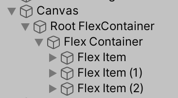
I setup each item with the same values as we chose in the CSS code above:
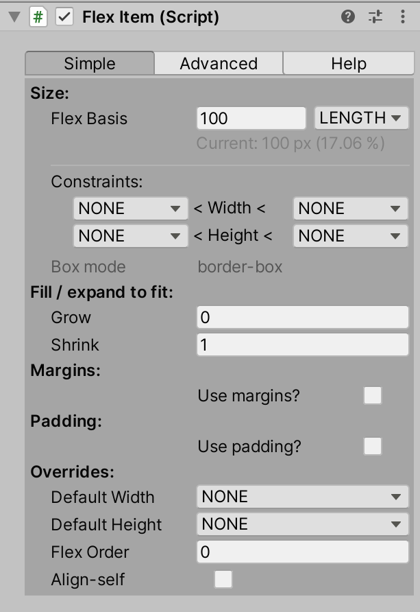
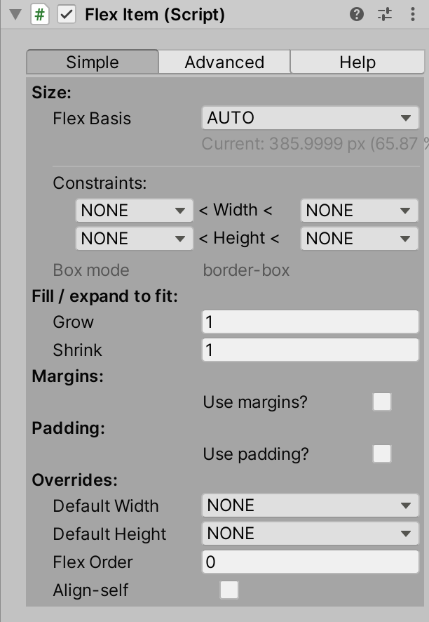
Note that the first and third items are both “100 px, grow: 0”, whereas the second item is “auto, grow:1”.
Testing it: resize and check the flow
Tip #6: while testing: resize the UI by hand and see what happens
When we think we’ve designed the UI correctly – when we think we correctly chose which kind of ‘fixed size’ to use in each place – the fastest way to discover we got it wrong is to try resizing the screen and see if it changes in the ways we desired/expected. Keep doing this frequently while building the UI.
So … Resize your Scene View (or Game View) window in Unity and check what happens: this is the best way to check if you’ve achieved the desired results. Unity has lots of features in the Editor for letting you simulate different screen-resolutions – now is the time to make use of them!
Improving the UI: dynamic-height header and footer
Try using the ideas from earlier – about combining ‘height’ with ‘max-height’ – to make a header that never gets smaller than a certain size, but can grow a lot bigger.
Note: when we start adding Text things are going to get a lot more complex here, but the basic ideas will remain the same. Testing and learning with the empty areas is the best way to get the hang of it: we’ll use exactly the same settings and controls when it comes to text.
Finishing up and moving on
At this point we’ve shown:
- To design a Flexbox UI start by breaking it into simple pieces
- Start with the biggest pieces of UI first, then get smaller and smaller
- Identify the fixed elements first and get them right
- Leave variable elements to Flexbox to automagically get right
- Test as you go
- Look for horizontal and vertical lines of layout
There’s a few obvious steps we need to take next. Firstly we need to fill-in the layout when there’s no more sub-layouts – e.g. the Header area which had no sub-parts.
Secondly we need to look at how to embed Text into the UI: it’s easy to get it in, but how do we get the text to auto-size itself, while the Layout also sizes itself, in different ways at once? What will Flexbox do? (hint: it mostly does The Right Thing automatically).
Finally we need to look at how we use spacing to cleanly and beautifully separate all the elements and sub-elements – this will be done using ‘margin’ and ‘padding’, two extremely powerful features of CSS that are also provided by Flexbox 4 Unity.
If you have any comments or questions – or you’d like to see more – please join the free Flexbox4Unity discord.