To recap … in Part 1, we learned:
- You can create UIToolkit UI’s entirely in code, with no CSS files, no extra documents, everything in one place: easy to write, easy to maintain, simple and efficient
- Everything in UIToolkit is laid-out using CSS Flexbox (which also exists for the more mainstream UnityUI system, if you get the Flexbox4Unity add-on linked on this site)
- UIToolkit UI’s have to be embedded in something, and make heavy use of the Q method
Now we’ll build a super-simple example UI using pure code (no external files!).
Each place that you want to use UIToolkit works slightly differently, and requires slightly different setup. For this example we’ll start with an EditorWindow, scroll down to see examples of Custom Inspector etc.
EditorWindow: Creating/finding a Root container
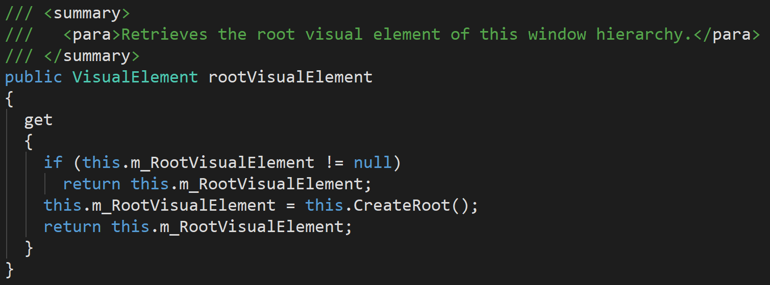
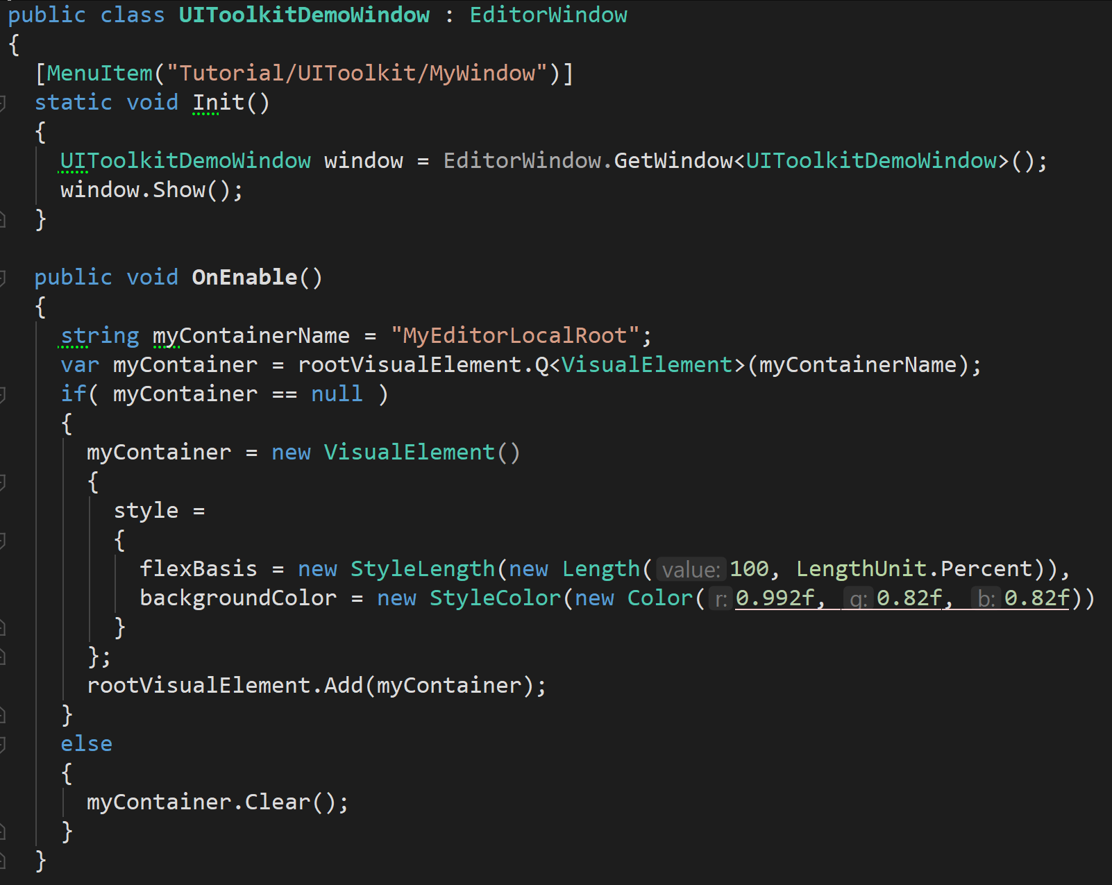
Our first challenge is: we need a container to embed things into (recall from Part 1 that CSS Flexbox always requires things to be embedded in / parented to an existing UI item). Unity gives us one in the built-in EditorWindow property “rootVisualElement”.
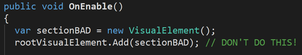
…and we can immediately start adding things to that, changing its layout, etc. However, that’s bad practice: it’s like making all the variables in your game “global”. For simple cases you might think: “I don’t care”, but you stand to lose one of the super powerful features of UIToolkit: write a GUI once, then re-use it in different parts of your app/game/editor.
To do that, we’ll have our GUI immediately create a dedicated sub-container, and only alter the sub-container. This way we can embed our sub-container inside other GUI’s and know it will work without any code changes.
Creating a local root/sub-root container
Unlike Unity’s oldest GUI system (IMGUI) which lays the GUI out immediately, and unlike Unity’s current GUI system (UnityUI) which lays the GUI out in the editor, we normally layout UIToolkit inside OnEnable: every time the EditorWindow is re-displayed/re-loaded/closed-and-opened-again, we’ll auto-recreate the GUI. UIToolkit will then persist it until it’s closed/destroyed/re-compiled.
We can directly add a child element to the root – but if we do that it’ll keep adding new ones every time you refresh or close/open the window:
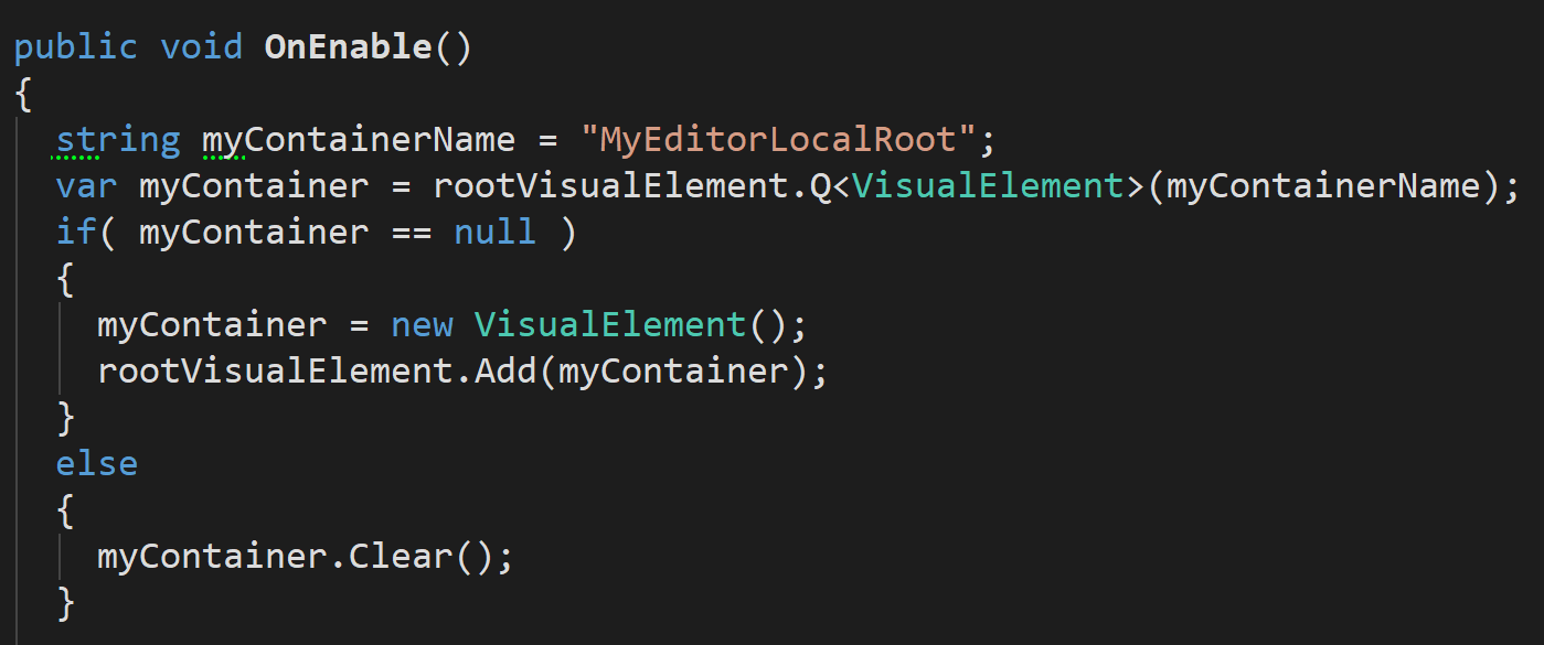
Instead … we’ll give our new container a unique name (UIToolkit is designed so that each item in the UI is expected to have a name – they are optional, and they aren’t unique, but you control them so you can manually make sure they’re unique), and then we’ll re-use it if exists already, or create-and-add it if not:
Things to note:
- We used the Q method already (Q for “query”: it finds UI items inside the UIToolkit hierarchy for you. Note: UIToolkit does not use GameObjects or RectTransforms so you can’t use the normal Unity methods for finding elements. UIToolkit has its own code-only hierarchy, which isn’t displayed in the UnityEditor (although there’s a visual debugger we can use – more on that later).
- If we don’t find the Container, we create it. If we do find it, we wipe its contents (Clear())
- Finding the item was very simple: we searched by name. If our name wasn’t unique this wouldn’t work – there are other more powerful ways to search (not covered here)
Making our local root fill the space
By default CSS Flexbox is smart: all UI elements only take up the exact amount of space they need, no more no less. (A lot of the code in Flexbox4Unity (my asset that backports CSS Flexbox into UnityUI) is dedicated to implementing this for classic UnityUI widgets – Label, Text, Toggle, Button, etc – and forcing them to be the ‘correct’ size, where UnityUI generally makes them a random size which isn’t the one you want).
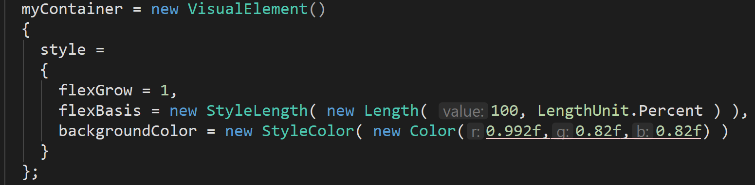
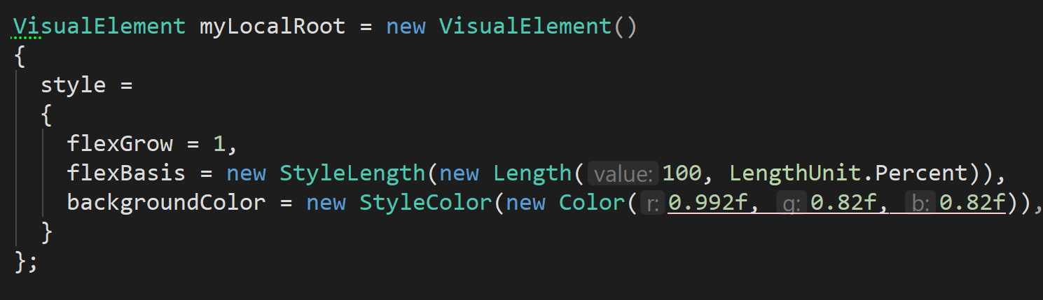
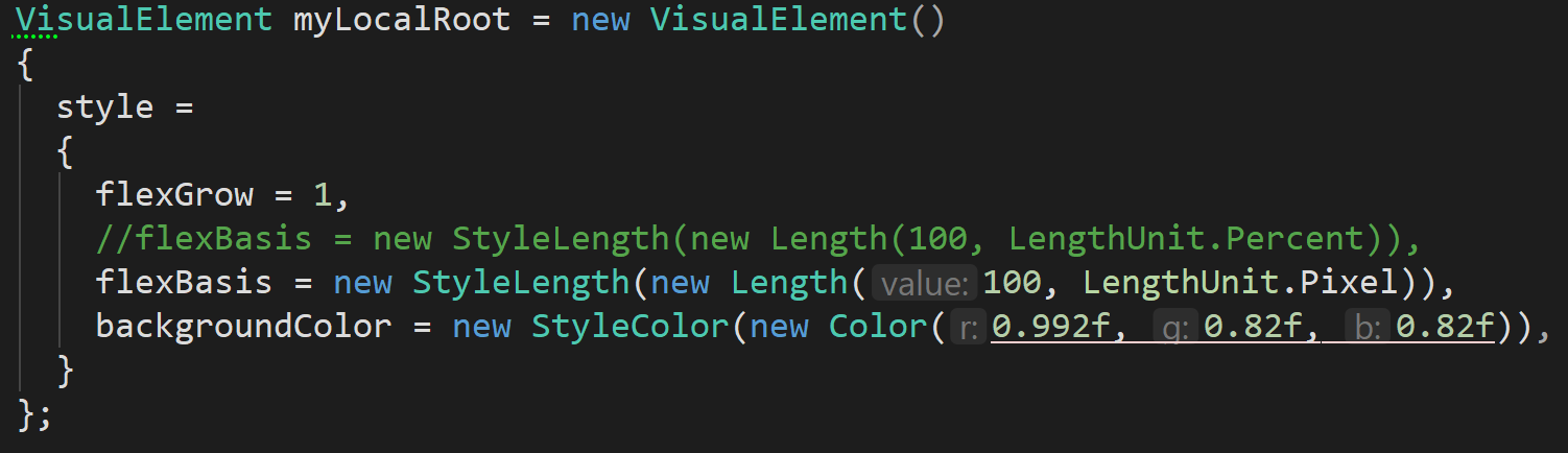
Our new container has no contents, so …. in CSS Flexbox it will be zero size. We want to say “actually, make this container take 100% of the available space”. That’s trivial – we assign a style and set the Flexbox params (all Flexbox params start with the word “flex” – this is part of the CSS specification):
Notes:
- Here we’re using the modern-C# style of “new classname() { override internal properties }”. If you haven’t used that syntax now is a great time to learn it – it greatly reduces the amount of typing you have to do, and makes it much easier to copy/paste and re-use code.
- …if you haven’t used it, it’s the same as writing:
- myContainer = new VisualElement();
- myContainer.style = new Style();
- myContainer.style.flexGrow = 1;
- …etc. You see how this is a lot more typing…
- …if you haven’t used it, it’s the same as writing:
- I set flexGrow to 1 – that should be the default according to the spec, and means “if you have spare space, grow to fill it”, so it’s not necessary but it makes it clearer later on.
- I set the flexBasis to “100%” – flexBasis is Flexbox’s most important property, meaning “the main size of this UI element”.
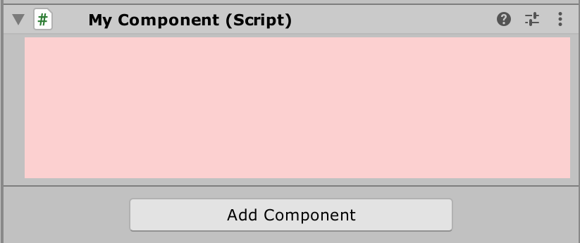
If you now save your class, go back to the Editor, and open your EditorWindow, you should find you get a window with a pale pink background – showing that our embedded sub-container is taking the whole available space. Resizing the EditorWindow will smoothly re-size and re-draw the sub-container to continue filling 100% of the space.
Your complete class should now look something like this, and be launched from the UnityEditor menu “Toolkit”:
Custom Inspector: Creating/finding a Root container
But … what if we wanted to make a Custom Inspector with UIToolkit instead? It’s very similar but not the same. Instead of EditorWindow.OnEnable, and instead of rootVisualElement, we override a method in Editor and we return the thing we want to act as a rootVisualElement (this pushes you more towards writing re-usable GUIs, which is nice – but it’s a shame it’s not the same code as for EditorWindow).
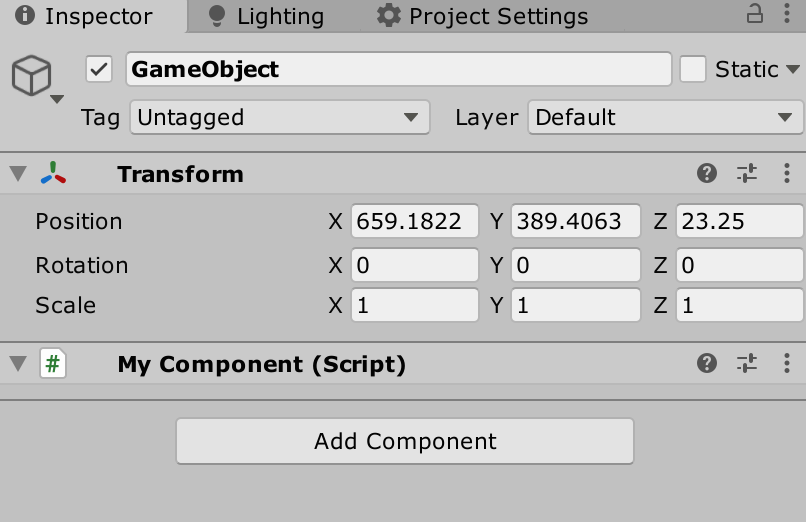
First create a dummy MonoBehaviour, and create a custom Editor for it (making sure you place your custom Editor in a sub-folder named “Editor”, or in an Editor asmdef if you’re using assemblies):
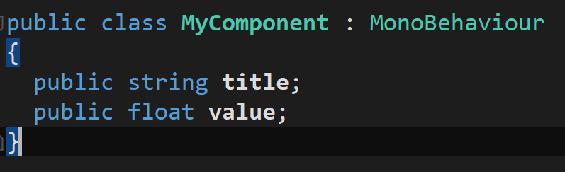
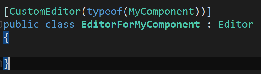
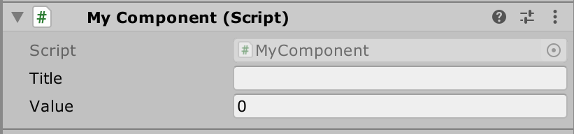
Create a GameObject in your scene, add that component, and you’ll get a default inspector (because your Editor isn’t overriding Unity’s defaults yet):
To customize it using UIToolkit the magic method we have to override is “CreateInspectorGUI”:
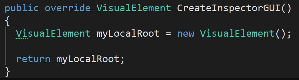
…to make it look the same as our EditorWindow example, we’ll customize that VisualElement in a similar way:
…but it didn’t work:
What happened? Unfortunately Unity diverges a little from the CSS specification here – but that’s forgivable: a Unity Editor isn’t quite the same as a Web Browser. We specified we wanted 100% size but it didn’t give it to us.
Well, actually … it did. But Unity’s tweak is that where Web Browsers give you the size of the window as your base parent-size, Unity’s Custom Inspectors give you a zero-height empty Inspector as your base parent-size. 100% of 0 is … 0.
Specifying the height of something with Flexbox
There are two different ways we can fix this, both with pros and cons. We’ll do both.
Option 1: state a specific height in pixels
This is NOT the preferred way – but sometimes it’s the correct way. In this particular case: it’s actually the best way of doing it.
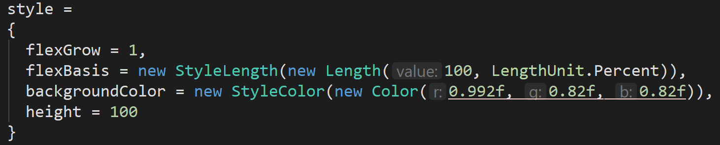
In Flexbox, because it’s a subset of CSS, you can simply override the entire flex system and say “I want to be this many pixels high, and this many pixels wide”. You set the property “height” of your style object:
…giving us:

Option 2: tell flexbox to do it for us
The more correct way of doing this (which is able to auto-adapt to different screensizes etc) is to tell Flexbox what height we want and let it sort it out for us:
…giving the same effect:
Massively important: when to use “flexBasis” vs “height” (or “width”)?
Recall from Part 1 that Flexbox is designed to switch easily between horizontal and vertical layouts – it in fact re-uses the variable names, the concepts, everything between the two, so that you can write a UI once and simply click a single button and switch the whole UI from “horizontal” to “vertical” – even your source code doesn’t need changing, it auto-adapts.
This is why flexBasis is called “basis” instead of “height” or “width”: the FlexContainer that you’re embedded inside dictates whether you are a horizontal flow (flexBasis will define your width) or a vertical flow (flexBasis will define your height).
Unity’s Inspectors always flow top to bottom, so they have pre-configured the parent container of Custom Inspector layouts to be in vertical mode. That’s why we can set flexBasis or height and we see the identical results.
If your parent container / root container has been correctly configured you won’t notice the difference – until you embed your code somewhere else, where the parent container is in a different mode (e.g. horizontal). The version of your code using flexBasis will auto-adapt, but the version using height will still try to layout vertically, and cause a mess.
So why did I say “height” was correct in this situation?
…because the UnityEditor does not allow horizontally displayed Inspectors – it is fundamentally designed not to work that way (maybe in Unity 2022, or Unity 2023, they will remove that constraint and we can have horizontal inspectors – UIToolkit would make this easy!). So, for now, it is correct to set the “height” of your inspector: it has specific meaning in this context.
(This is why CSS allows both: the CSS authors understood that sometimes you really do need to explicitly set a “height” not a “height-or-width, could be either, depends on the current layout scheme”).
Absolute positioning / Native Rendering / IMGUI: Creating/finding a Root container
But what if you want to position things in absolute co-ordinates? e.g. draw a map with annotations at specific pixel coords – this is something that Unity has supported natively since the very first version almost 15 years ago. But CSS Flexbox doesn’t allow it – it wants to force-position everything.
The third and final layout I wanted to mention is mixing old-style Unity IMGUI with new-style UIToolkit. This may seem absurd, but … there’s an entire magic class that Unity has provided that makes it work, and it works rather nicely. At this point I’ll only touch on it briefly, enough to get you started. I used it to create this code-visualization that is embedded inside a UIToolkit layout:
Notes:
- That’s a UIToolkit custom EditorWindow
- …containing two UIToolkit containers, each one set to horizontal mode
- The first container has two buttons
- The second container has three tab-bar buttons
- …and set to vertical mode, so that the buttons appear in two rows.
- The remaining space is auto-allocated 100% to a live render of the C# source-code using bubbles that animate around.
- … all rendered using traditional Unity IMGUI
- … and even using Unity’s Handles.* API
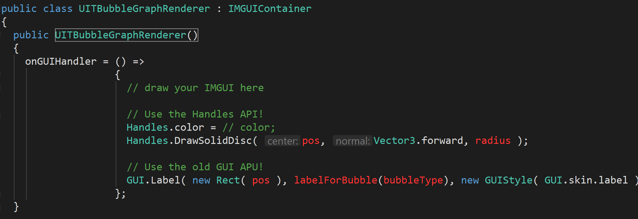
You have to subclass IMGUIContainer (the Unity-provided magic class), and then you need – you guessed it – a third incompatible way of getting your root drawing surface ;). This time it’s a function you assign to called “onGUIHandler”. Within that function you can use all the traditional IMGUI bits:
If you get stuck and need more detail on this, email me (adam.m.s.martin at gmail), and I’ll try to make time to do a more detailed writeup. However it’s essentially “just use IMGUI”, and surprisingly (delightfully!) it all Just Works.
Next … Filling in your UIToolkit UI with common UnityUI widgets
We’ll cover: Label, Button, Int/Float/Bool/Object Field, and how to get data into and out of your UI.
If you find these tutorials useful then you could thank me by:
- Sharing them with other people
- For your UnityUI code: trying out Flexbox4Unity (mostly useful for using these same techniques to make in-game UI, which UIToolkit does very badly at the moment)