This tutorial is for anyone writing editor UI’s – e.g. Custom Inspectors, EditorWindows, etc – using Unity’s new UIElements/UIToolkit. Make sure you’ve read the previous articles on core concepts and how to access the root container/VisualElement.
(NB: UIToolkit doesn’t work properly with Unity’s own TextMeshPro/3D rendering/animation/editing/etc, so for in-game UI I recommend Flexbox4Unity instead (unlike UIToolkit, Flexbox4Unity is integrated with UnityUI and supports all of the Unity3D core features). Both systems are based on Flexbox, so they are very similar.)
Setup
All the code examples below assume you already have a reference to your main VisualElement (see the previous articles for how to get this for EditorWindow, or for custom Inspector/Editor – it’s different for each), and that you’re passing that into a method e.g.:
public void BuildUI( VisualElement root ) { ... }Labels
Creating a label is very easy, you can either use the constructor, or directly assign a value to the .text field:
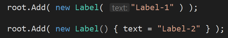
…both are identical, but only the latter (assigning to .text) is compatible with other UIToolkit elements (e.g. Button), so I recommend using that approach for consistency in your code (and it makes it very slightly easier to convert a Label to a Button in future if you change your UI to be more interactive).
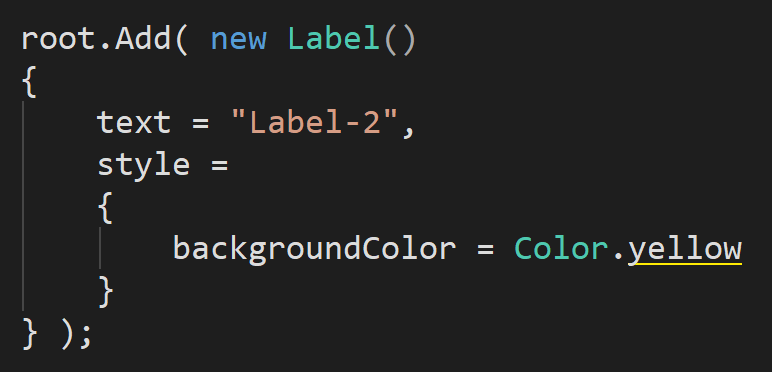
Styling (any UIToolkit VisualElement)
Since UIToolkit is based on CSS, anything and everything uses the same shared system for styling – what works for one, works for all. All the UIToolkit components are subclasses of VisualElement, and that’s the class that provides the all-important field: “style”.
All the basics of CSS styling are here: margins, padding, borders. There are a million great tutorials for these on the web if you’ve never done CSS before.
(NB: some of the useful shorthands in CSS – e.g. setting all margins with a single command – have been removed by the UIToolkit team (they were originally included – they are part of the CSS specification!). I’ve logged these as bugs in Unity, but so far they’ve been rejected.)
Example: a styled Label
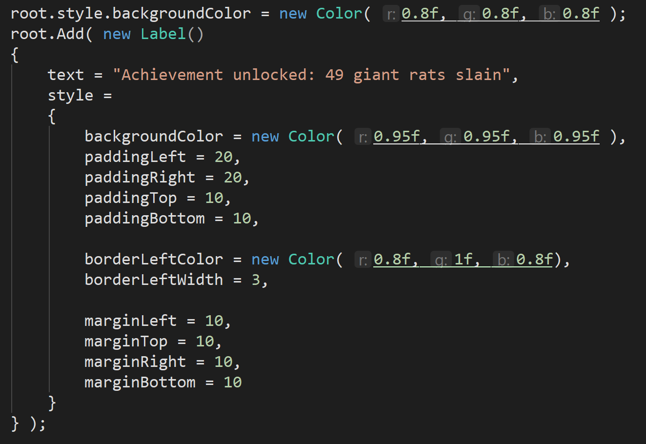
For a quick example: let’s make an info card that might appear temporarily as a warning at the top of UI.
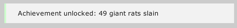
This is done using a combination of:
- background-color — to make it lighter than the parent VisualElement
- padding — to create a nice amount of space around the text but INSIDE the box, allowing it to ‘breathe’
- border-left — for the green bar on the side
- margins — to push-away everything on the OUTSIDE of the box and make sure that there’s a clear gap between this label and those around it